In-Depth Guide to Color Profiles: Setting Up Screen Printing DTF Colors to Match Your Screen
End the frustration of color discrepancies between print and screen! Dive into the techniques of setting up Color Profiles, from calibrating your monitor to configuring the RIP software for DTF screen printing to achieve accurate colors.
Introduction: The Major Pain Point for Screen Printers - “Why does the printed color not match what I see on the screen?”
For screen printing shop owners, especially in the era where DTF (Direct to Film) systems dominate, the most frustrating and common issue is not about machine breakdowns or film peeling, but rather “color inaccuracies.”
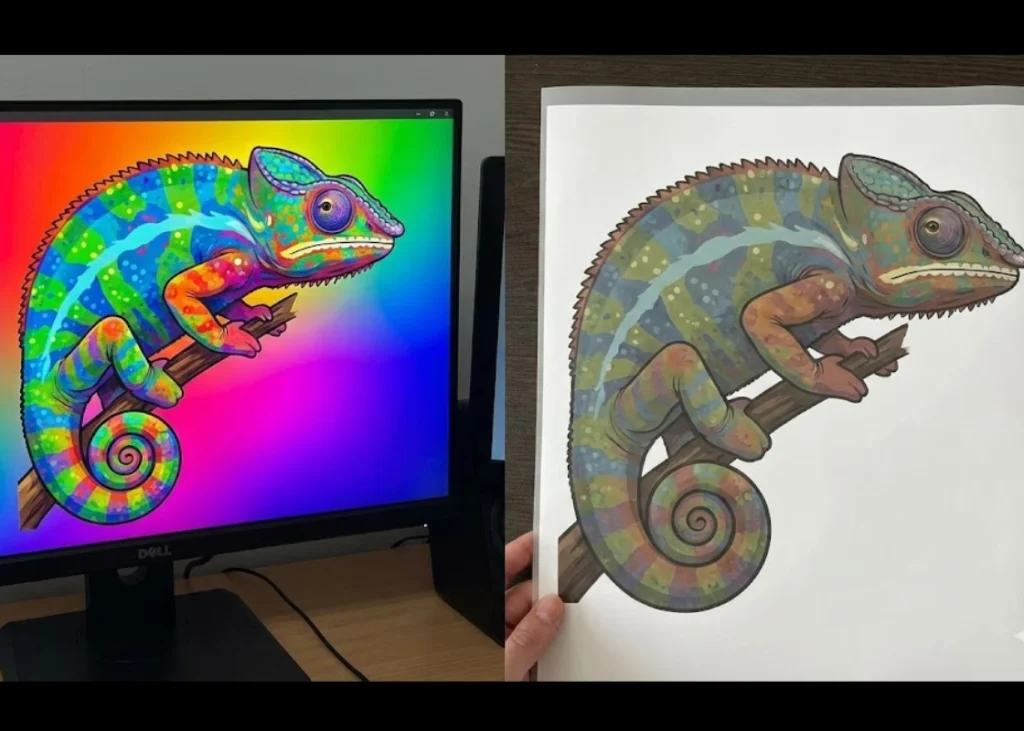
Have you ever experienced this? Designing a vibrant red logo on your computer screen, approved by the client, only to find that the printed color through the DTF machine turns out to be a dull orange-red or a deep blue that looks elegant becomes a bruised purple on the film.
This issue causes more damage than expected, including ink costs, wasted film, time spent fixing the problem, and most importantly, “client trust.”
Many try to solve the problem by adjusting the original image colors to be more vibrant, hoping the printed color will be less saturated, or some might think the ink or machine is the issue. However, the real cause of this problem lies in the lack of understanding of “color management” (Color Management System - CMS) and its crucial component, the “Color Profile.”
This article will guide screen printers and shop owners into the world of Color Profiles in DTF systems. We will stop guessing and start using scientific principles to set up from the source (monitor) to the end (RIP software) to ensure your screen prints are “color accurate” professionally.
Understanding the Root of the Problem: Why Do the Screen and Printer Speak Different Languages?
Before setting up the configuration, we need to understand why there is a discrepancy. The simplest answer is: computer screens and DTF printers create colors in fundamentally different ways.
-
The Language of Light (RGB - Red, Green, Blue): Computer screens and mobile phones display colors by emitting light. The colors you see are a result of mixing red, green, and blue light. The more light is mixed, the brighter the color. The color gamut of light is very wide, allowing for vivid, bright, and intense colors (think of the reflective green on a screen).
-
The Language of Ink (CMYK+W): DTF printers work by spraying ink colors onto film (Cyan, Magenta, Yellow, Black, and White). These inks do not emit light but rather absorb it, reflecting the remaining light. The color gamut of ink is much narrower than light, meaning some very bright colors on the screen (like neon colors) cannot be accurately printed with standard CMYK ink.
When “one speaks the language of light” and “the other speaks the language of ink,” without a good translator, communication will be flawed. The red you see on the screen may be interpreted as a different shade of red by the printer. This is the source of the discrepancy, and the “translator” in this system is what is called an ICC Profile.
The White Knight: What is an ICC Profile, and Why is it Important?
An ICC Profile (International Color Consortium Profile) is a small data file with the extension .icc or .icm, acting as a “dictionary” or “translator” for each device.
- Monitor Profile: Tells the computer how your screen accurately displays red and green colors.
- Printer/Ink/Media Profile: Tells the RIP program what the actual printed color will be when using this printer model, this ink brand, and this film type, and what the maximum achievable color gamut is.
If you use an incorrect profile or no profile at all (letting the program guess randomly), the RIP program will send incorrect color commands to the printer, resulting in color discrepancies in the printed work.
Having a “specific” ICC Profile for the ink and film set you use (Custom Profile) is the most crucial aspect of achieving accurate colors in DTF printing.
Step 1: Start with “Monitor Calibration” (Calibrating the Screen)
If the scale is off, how can it weigh things accurately?
Many businesses fail at the outset because they try to match printed work with a screen that has “never been calibrated.”
Each brand, model, or even the same model that has been used for different lengths of time, displays colors differently. Some screens are too blue, others too yellow. If you edit images on a screen with incorrect colors, you are working with flawed data from the start.
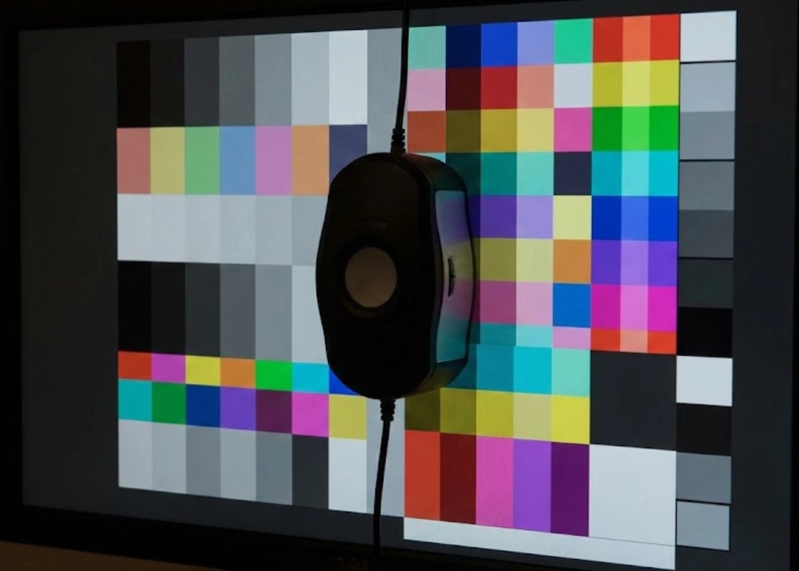
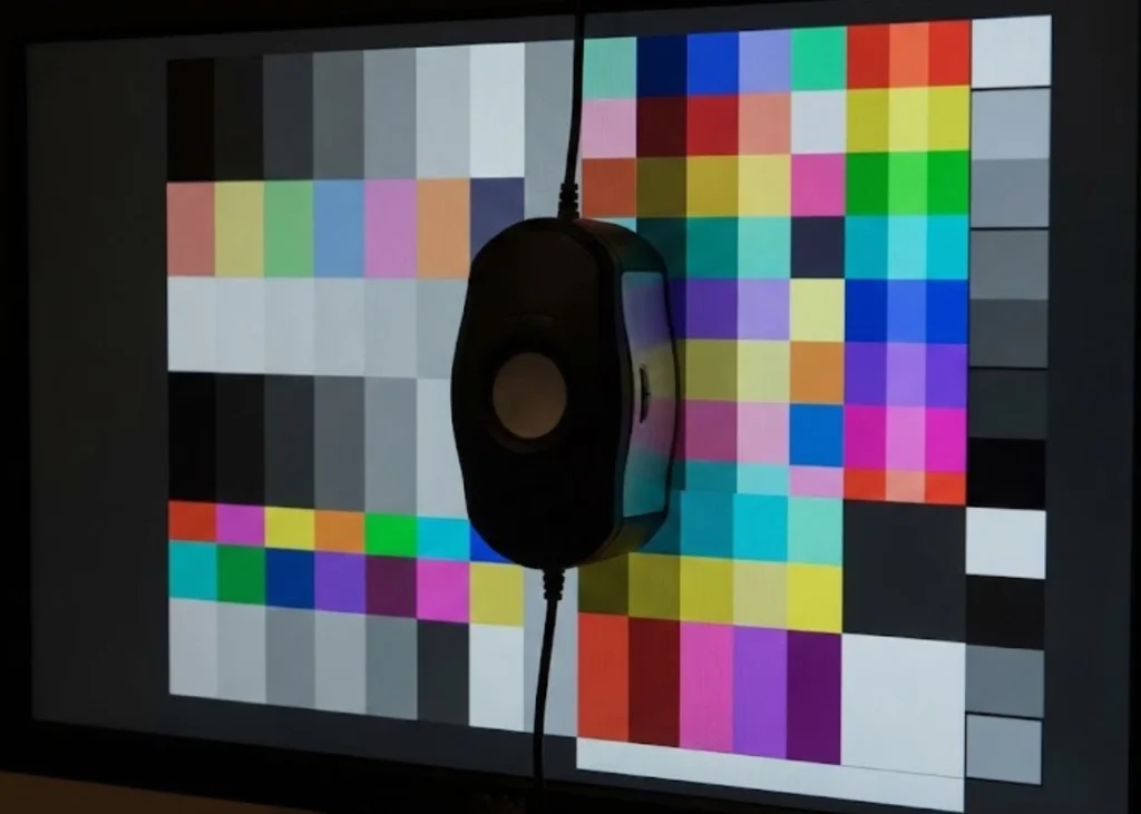
The correct method: Hardware calibration. Adjusting the screen’s color manually or using general screen calibration software is insufficient for professional work. You need a device called a “Colorimeter” (such as Datacolor Spyder or X-Rite).
This device is placed on the screen and works with software to measure the actual colors displayed by the screen. It then creates an accurate “Monitor Profile” to force the graphics card to display the most accurate colors according to global standards.
Tip: Calibration should be done in the actual working room lighting conditions and repeated every 1-2 months because the screen’s light bulbs deteriorate over time.
Step 2: Setting Up in Design Software (Adobe Photoshop / Illustrator)
Once the screen is calibrated, the next step is to prepare the work files. Adobe software has a complex color management system that needs to be set up appropriately for printing.
Working Space: Go to Edit > Color Settings… In the RGB section, select “sRGB IEC61966-2.1” for general work that customers send in, or choose “Adobe RGB (1998)” if you control the entire process and require a wider color range (but ensure your monitor can display Adobe RGB accurately). For CMYK in DTF work, this step is not critical because we usually send RGB files to the RIP for further processing.
Color Management Policies: Set the program to alert you when opening files with a profile that does not match your working space, so you can decide whether to convert the colors or preserve the original values.
Soft Proofing: This feature allows you to “preview” how the colors will look when printed, showing how much color will drop out. Go to View > Proof Setup > Custom… and select the ICC Profile of your DTF printer (if available). This helps you adjust out-of-gamut colors before sending the file for actual printing.
Step 3: The Crucial Step! Setting Up the Color Profile in RIP Software (RIP Software Setup)
This is the step that determines whether your work will be “great” or “disastrous.” RIP software (such as AcroRIP, Maintop, CADlink Digital Factory) converts image files into tiny dots to instruct the printer heads and, importantly, it handles “color space conversion.”
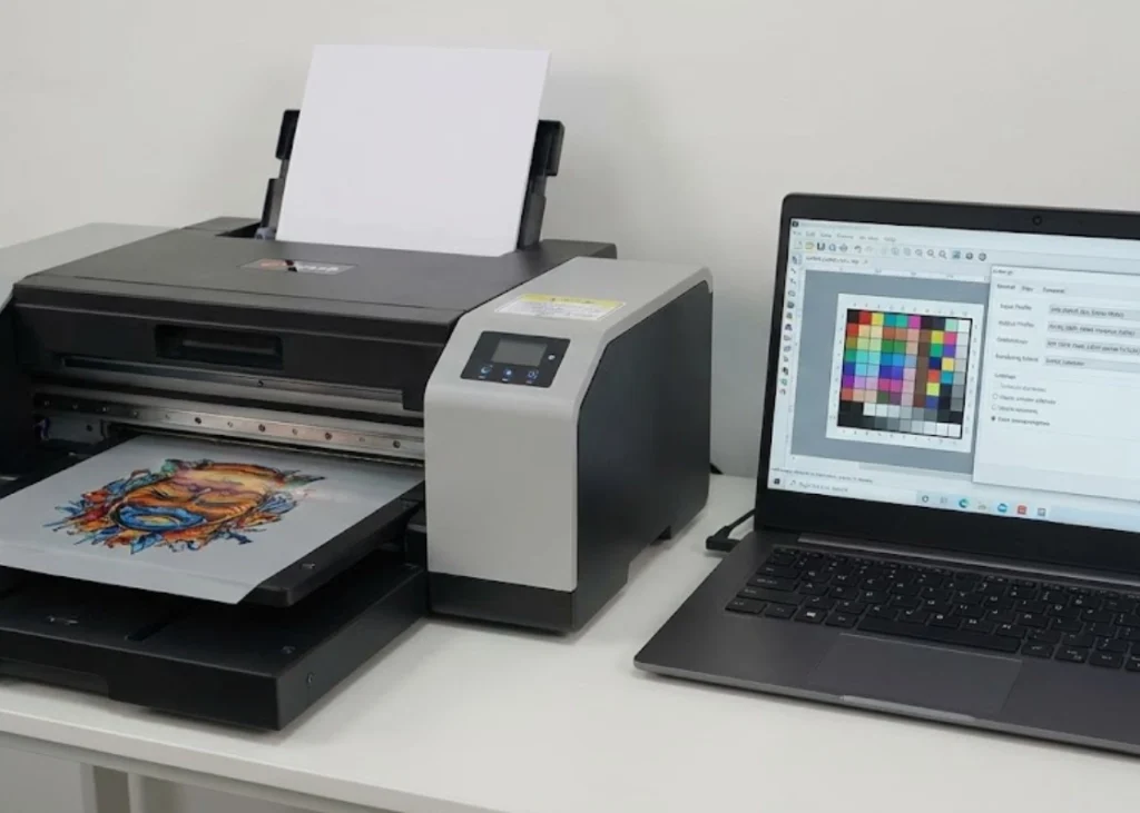
The setup in each RIP software may look different, but there are three key parts to pay attention to:
-
Input Profile (Input Profile): You must tell the RIP which color standard your incoming image files are based on. For example, if you create your file in sRGB, you must select sRGB in the Input Profile (RGB) to ensure the RIP reads the original color values correctly.
-
Output Profile / Media Profile (Output Profile): This is the most crucial part of this article. You must choose the ICC Profile that is specifically created for the “printer + ink + film + powder” setup you are using.
Do not mix profiles: Using a profile for ink brand A with ink brand B will definitely result in color distortion, especially in gray tones (Gray Balance), which might come out greenish or reddish.
Where to find: Good ink or printer suppliers should provide standard ICC Profiles for their ink to download, or the best option is to “hire custom ICC Profile creation,” which involves printing a color test strip with your machine and using a light meter (Spectrophotometer) to create the most accurate profile for your specific machine.
- Rendering Intent (Color Conversion Method): When some colors in the original file (RGB) are too vivid for the ink (CMYK) to print, how does the RIP handle the excess colors? This is the job of Rendering Intent, which has main options such as:
Perceptual (Most commonly used in screen printing): Attempts to maintain the overall color relationship in the image to look natural to the eye by compressing all colors within the printable range. Suitable for photographs or graphic work with many color tones.
Relative Colorimetric (Suitable for logos): Colors that can be printed accurately will be printed accurately, while colors that exceed the range will be pulled to the nearest color at the edge of the Gamut. Suitable for work requiring color accuracy of brand CI or logos.
Tip: For most DTF work, it is recommended to start with Perceptual. If you feel the colors are still not as desired, try switching to Relative Colorimetric and compare the results.
Summary: A worthwhile investment for professionalism
Managing Color Profiles in DTF work may seem complicated and difficult at first, requiring investments in calibration equipment or costs for custom ICC Profile creation.
But believe me, this is the most worthwhile long-term investment. When you control the colors, you will significantly reduce waste from printing errors, work faster because you won’t have to guess and adjust colors randomly, and most importantly, customers will trust in your professionalism, knowing your shop can print work with beautiful, vivid, and “accurate” colors every time.
Ready to Print Custom DTF with Screen168 Bangkok?
Single pieces to bulk wholesale. Free artwork file check and instant online pricing 24/7.
🚀 View Sizes, Prices & Order Online→